
DB4IoT/RouteAnalyst is a breakthrough technology that gives transportation engineers and planners the ability to view hundreds of millions of movement points instantly and show exactly when and where traffic is slowing down bus movement and creating service delays.
Public transit agencies are tasked to move as many people as possible from one place to another as quickly and predictably as possible. It is very important for transit agencies to understand how well they are performing this task and how they can improve travel times and predictability. With DB4IoT/RouteAnalyst transit agencies can look at each individual route over time and maps simultaneously to analyze how driving speeds, travel delays, passenger loads and headway change. This helps transit agencies to identify bottlenecks and look for ways to improve these. DB4IoT/RouteAnalyst is a very powerful tool when discussing traffic improvements with cities, counties or funding agencies.

Figure 1. SpeedMap; TriMet buses record their speed every five seconds.
Each colored dot shows a speed measurement of a bus.
Most public transit agencies have installed Computer Aided Dispatch & Automated Vehicle Location (CAD/AVL) systems on their buses as part of their Intelligent Transportation System (ITS). These CAD/AVL systems generate enormous amounts of data. Agencies routinely back this data up but do not keep it accessible. Moonshadow Mobile has introduced a service, DB4IoT/RouteAnalyst, to store this data long term and make it available for analysis. DB4IoT/RouteAnalyst was developed in close cooperation with DKS Associates, a leading transportation consulting firm in Portland Oregon, and data engineers from TriMet, the public transit agency in Portland, Oregon. This white paper describes how CAD/AVL data can be used to create long term speed maps that give transit agencies detailed insight into the driving speeds and congestion on their routes. DB4IoT/RouteAnalyst can also be used to get detailed insight in the speeds, delays, passenger loads and headway of any route at any time for any type of service day. The examples in this white paper are from Portland-based TriMet.

Figure 2. Data Flow for DB4IoT/RouteAnalyst
Setting up DB4IoT/RouteAnalyst starts with uploading the service schedule as a GTFS file and providing route maps. Transit agencies can upload their data files for buses to the DB4IoT servers daily after returning to the terminal or the data for multiple months can be combined in a single data feed. Use of DB4IoT/RouteAnalyst does not require any operational changes or software development by the transit agency. The only requirement is that the CAD/AVL files are made available on a server that DB4IoT has access to. TriMet uses the INIT CAD/AVL system and records so-called ‘Breadcrumbs’ every 5 seconds. The breadcrumb records contain the time, location, speed and several other variables. The INIT system also records service stop times, passenger counts and many other variables in a Stop Events database. Delays are recorded on the timed service stops. DB4IoT/RouteAnalyst has the capacity to store years of breadcrumb data and combine this in a single database that can be visualized over maps instantly.
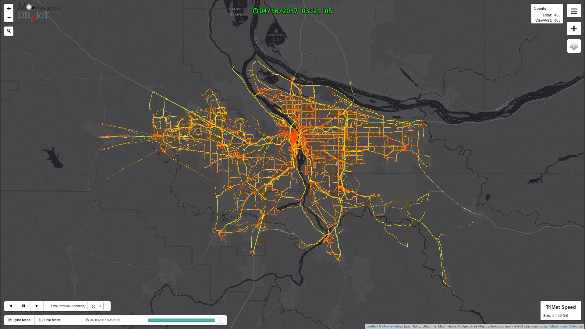
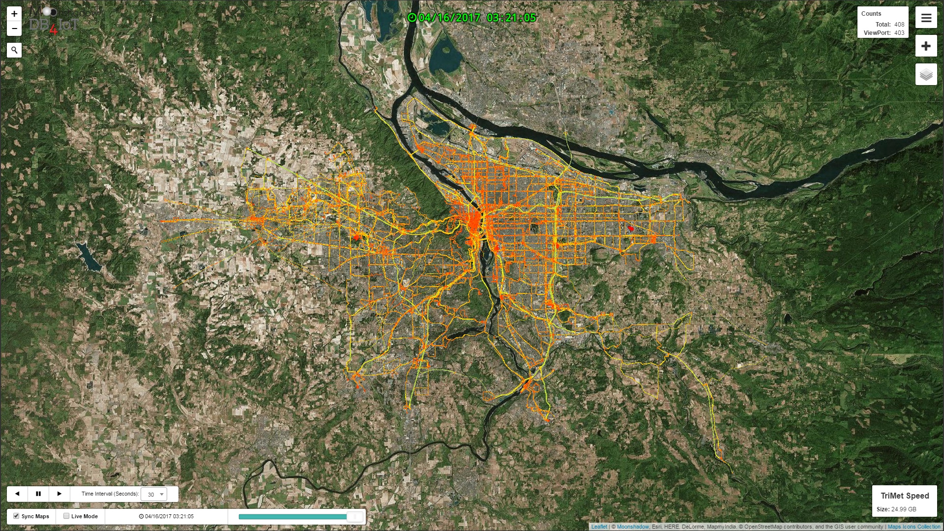
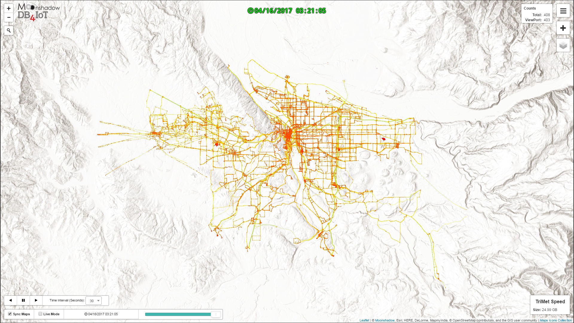
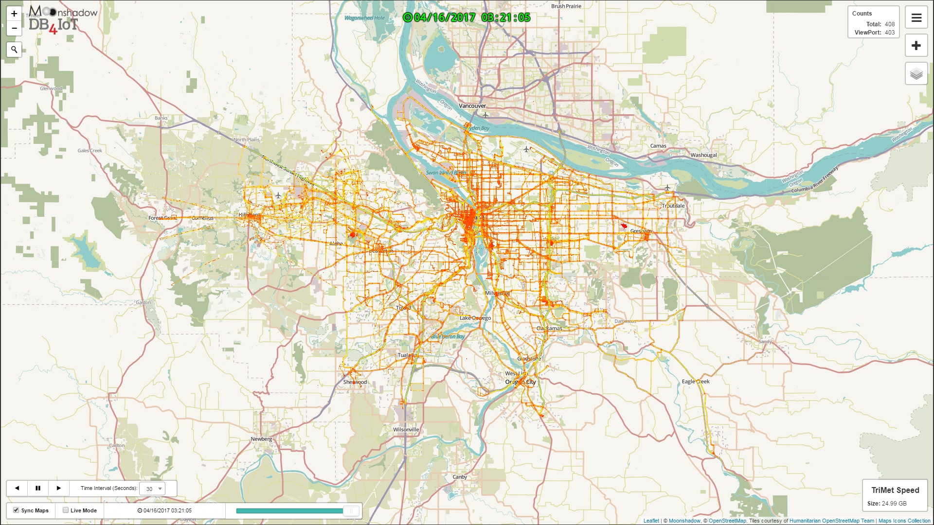
Figure 3. Speed Map of all TriMet Vehicles every Five Seconds for One Month
The above images show a month of speed data for all 743 TriMet buses and light rail. Slow speeds are shown in red, higher speeds in yellow and fast speeds in green. At five-second intervals the data adds up quickly and this database contains 90 million breadcrumb records. DB4IoT/RouteAnalyst comes with a variety of background map layers to visualize the data.
The speed maps show more red, and thus lower speeds, in the downtown Portland area. The freeways are visible as yellow lines. The images clearly illustrate that some segments of certain routes in the suburbs are much slower than in other areas.


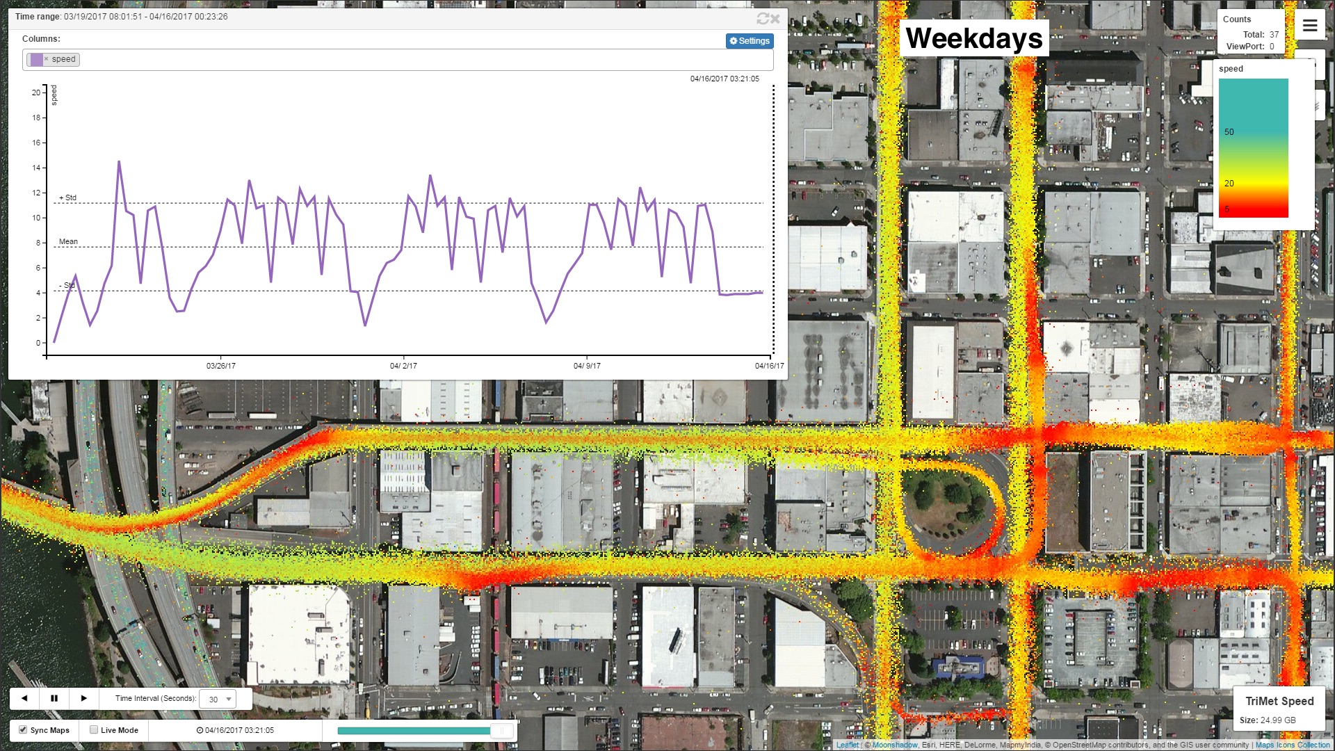
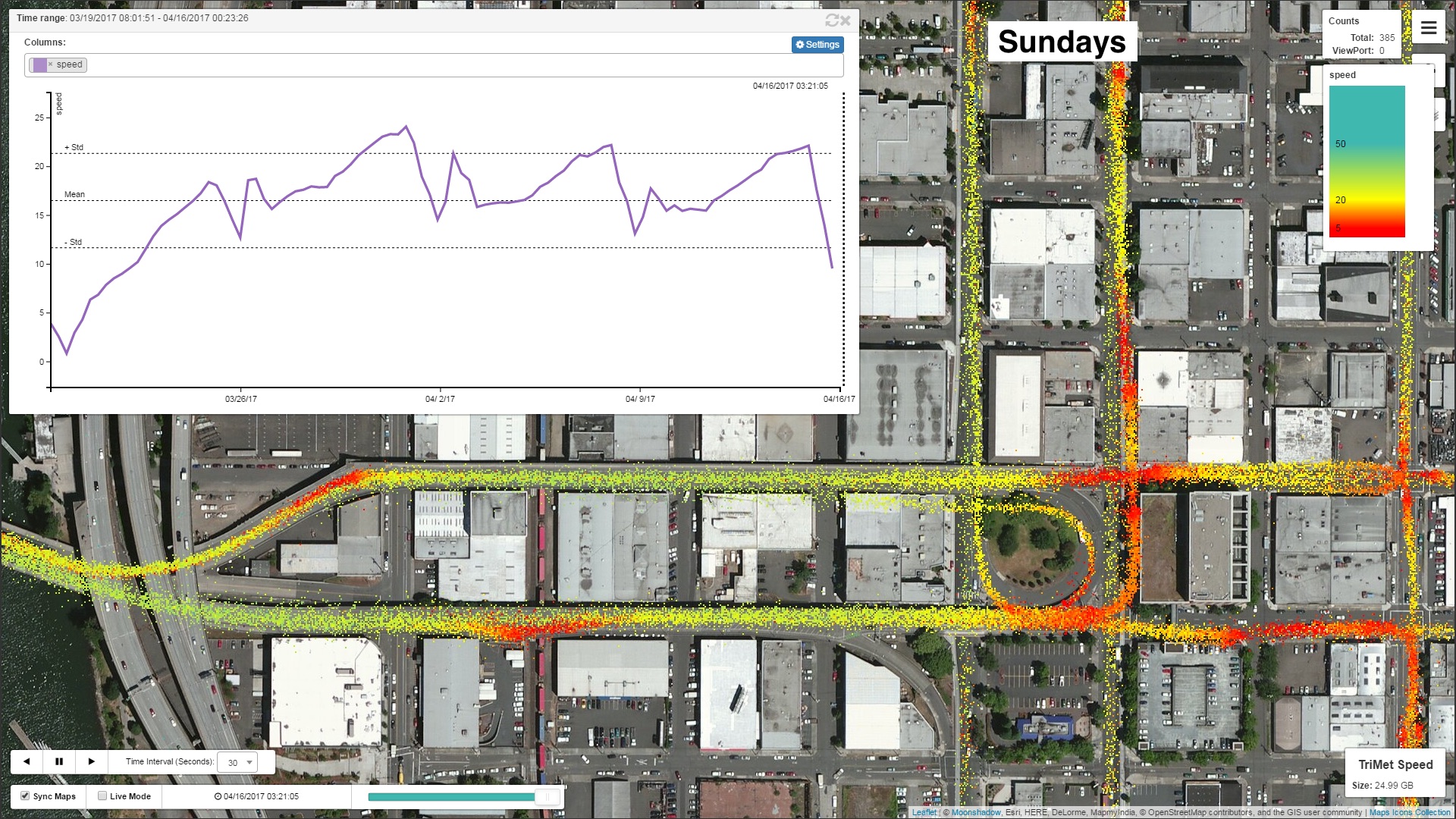
Figure 4. Speed Maps for the Hawthorne Bridge approach for different service days
With DB4IoT/RouteAnalyst you can zoom in to any area to view any specific point in time of any time range. In the above image series, we have zoomed in to the Hawthorne Bridge approach. Downtown Portland is just across the river to the left of these images. The above images show all traffic for a one-month period for four different service days. The “All Days” image shows (as the title indicates) all data for all days and therefore the number of recorded points is the highest and the lines are the ‘thickest’. Weekdays show higher traffic and slower speeds than Saturdays or Sundays. Higher traffic is visualized because there are more points and slower speeds are illustrated by more orange and red dots. The images also show that bus speeds are lower around bus stops and intersections.
We can look at the data in more detail by selecting time periods for each of the service days. The images below show the difference between the Weekday AM Peak, Midday and PM Peak. With DB4IoT/RouteAnalyst you can select any combination of service days and time periods and compare the traffic through maps, graphs or tables.

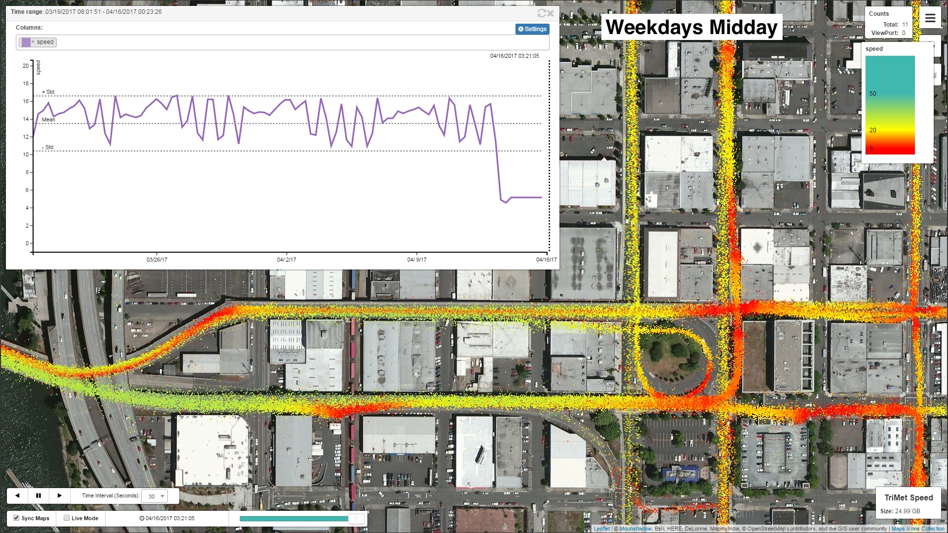
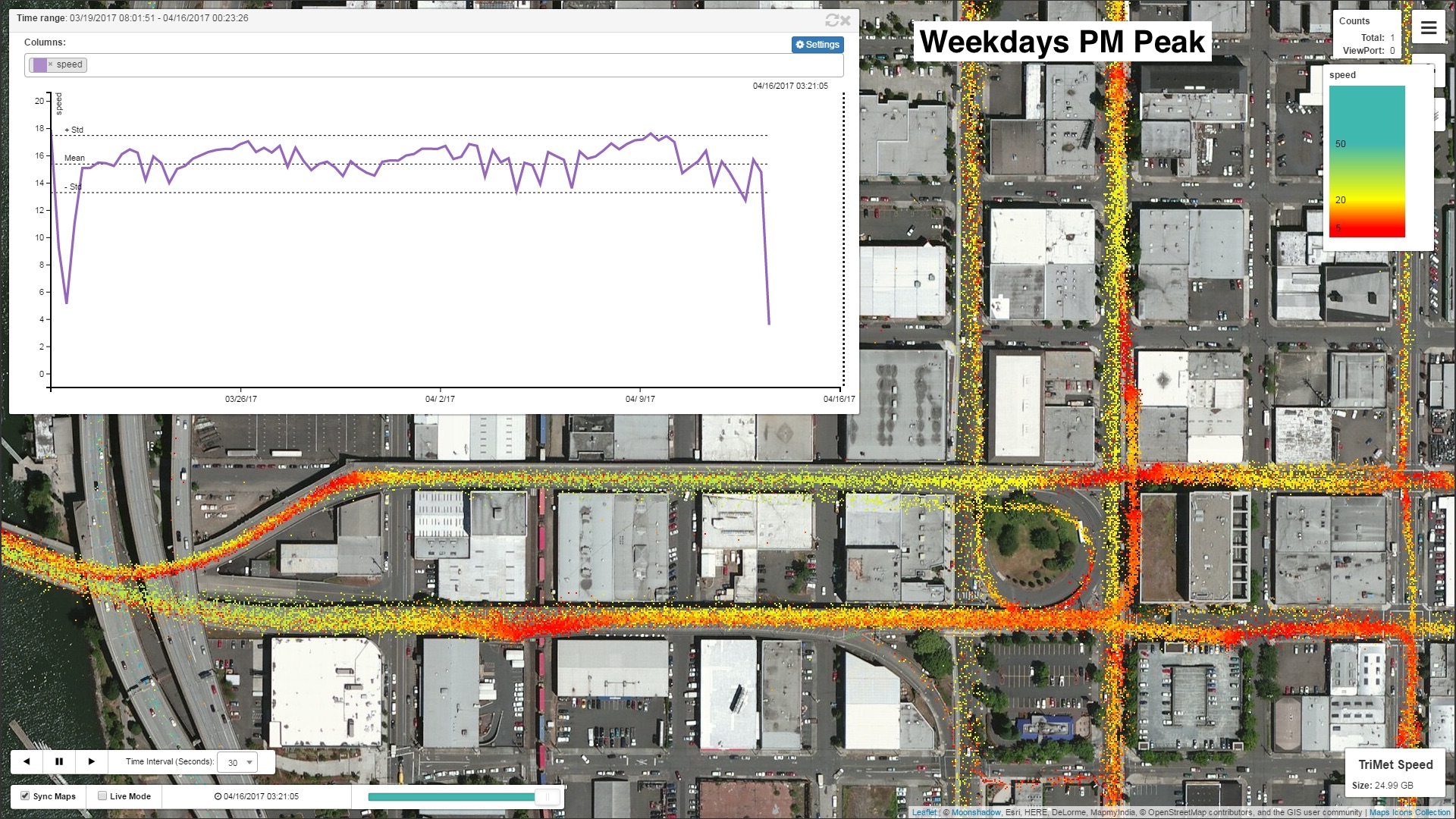
Figure 5. Speed Maps for different weekday time periods at Hawthorne Bridge approach
Figure 6. Hawthorne Bridge Approach AM Peak Speeds
There are several interesting things that we can learn from these detailed speed maps. Downtown Portland lies across the river to the left of this image. The one-way directions of the main arteries are shown with the purple arrows. We see that the inbound traffic to downtown is orange and red. Driving speeds are lower. The outbound street has higher speeds as we would expect for the AM peak. The density of dots is lower as well which means that fewer measurements were recorded. Bus service stops and traffic stops can be recognized as ‘red clouds’.

Figure 7. Hawthorne Bridge Approach PM Peak Speeds
On the left of the image we can see that buses have difficulty moving from the service stop just before the bridge on Madison into the left lane on the Hawthorne bridge as they pull up from the service stop. This is visible as a long red line. In the PM Peak image the traffic on the outbound street is much denser and slower than in the morning, as we would expect. At the intersection between Hawthorne and Grant buses must cross several lanes and move to the right lane for the service stop. The orange and red dots indicate that this slows the buses significantly. We see another interesting artifact at every service stop. Buses decelerate much faster than they accelerate. As a result, there are just a few slower recordings right before each service stop. The red tail behind each stop is caused by the slow acceleration of each bus.
With DB4IoT/RouteAnalyst we can visualize the bus Breadcrumb data by any variable. Instead of looking at the actual bus speeds it is also interesting to look at the delay of each bus.


Figure 8. Delay Maps for One Month of Bus Data
The above images show the average delay for all buses for a one month period for the entire TriMet service area. The top image shows the delays for all days and the bottom image for weekdays only. You can instantly see which routes have the largest average delays. The average delay times in the graphs are shown in seconds. To remove the effect of extreme outliers we only looked at delays that are lower than 10,000 seconds (just under three hours). We also only looked at buses that were running less than 1,000 seconds early. Delays are recorded only at the timed service stops. We assigned the average delay between two timed service stops to each breadcrumb by interpolating the difference in delay on the two timed service stops depending on the relative speed at the breadcrumb. Delays, of course, vary wildly depending on the time of day. The following image series compare the delays on service weekdays by the different time periods in the day.


Figure 9. Delay Maps for One Month of Bus Data by Time-period

Figure 10. Delays for all Buses for One Day
You can zoom in on the graph to look at a time period in detail. The above graph shows how the delay for all buses changes during the day.

Figure 11. Delays for Route 15 for One Week
With DB4IoT/RouteAnalyst you can filter the data by any set of variables. The above graph shows the delay for a single route over a one week period.
We can compare different variables in the graphs. The following chart shows the relationship between bus speed and delay. There is, roughly, an inverse relationship between bus speed and delay.

Figure 12. There is an inverse relationship between bus speed and delay
The above examples show how transit agencies can use DB4IoT/RouteAnalyst to visualize and analyze speed and delays from detailed CAD/AVL data. The system can be used to visualize any variables that are recorded and uploaded from passenger counts and dwell times to fuel consumption or other engine diagnostics.
In the images below we selected a single route, TriMet route number 15, and we looked at speeds and estimated passenger loads for both the Eastbound and Westbound directions. These images show the averages over all days. With DB4IoT/RouteAnalyst you can drill down further to look at the delays, speeds, headway or any other variable for specific time periods (AM Peak, Midday, PM Peak) on specific service days (Weekday, Saturday, Sunday). This shows transit analysts exactly when and where delays are occurring.

Figure 13. TriMet Route 15 Westbound Speed

Figure 14. TriMet Route 15 Eastbound Speed

Figure 15. TriMet Route 15 Westbound Estimated Load

Figure 16. TriMet Route 15 Eestbound Estimated Load
DB4IoT/RouteAnalyst can store hundreds of millions of records for thousands of vehicles and generate images and graphs in seconds. Please contact Moonshadow Mobile if you are interested in making your CAD/AVL data accessible long term.
For more info or to schedule an online demo.

