
Here’s a thing that has intrigued me for years: wouldn’t it be cool if we could convert our population databases with hundreds of millions of records into 3D models and fly through them.
Over the last few months we – finally – developed the technology to convert big databases into 3D models in a matter of seconds. After the model has been converted you can ‘fly’ through it in real time. We are using OpenStreetMaps for the underlying maps. This blog posting is the first time we are publishing images from the 3D models. I choose some of the more artistic 3D models that we created. These images show the population as an organic creature morphing over the map of the US.
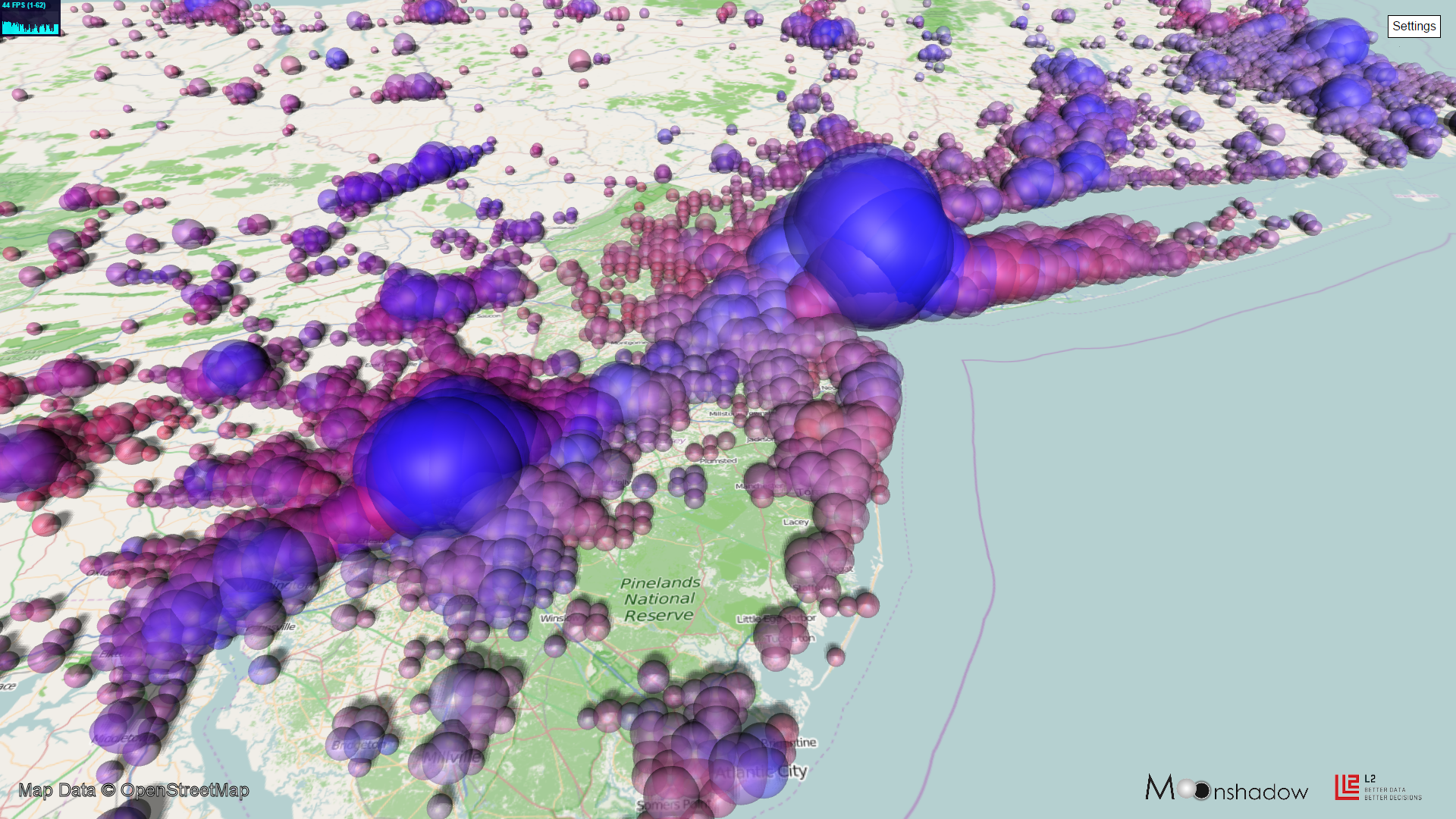
1. Washington DC, Baltimore, Philadelphia and New York Voters Colored by Party as Spheres
The above image shows the voters in four large metropolitan areas on the East Coast. The four large spheres show, from left to right, Washington DC, Baltimore, Philadelphia and New York City. Democratic voters are shown as blue spheres and Republican voters are shown as red spheres. Purple spheres represent areas with a mix of Democratic and Republican voters. The larger the sphere, the more voters live in that area. The big cities contain so many voters that there are spheres inside of spheres showing voters.
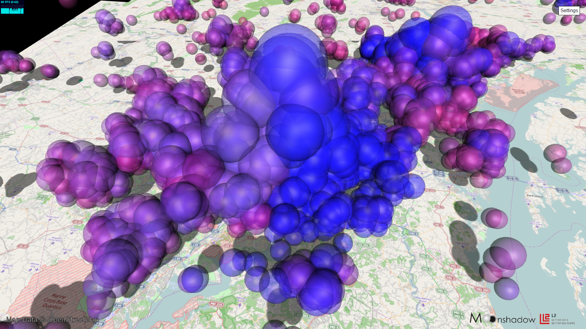
2. New York and Philadelphia Voters Colored by Party as Transparent Spheres
When we zoom in we can generate the model at a higher level of detail. Image #2 shows a closer look at Philadelphia to the left, New York City in the middle and Boston in the far distance. You can see how the more Republican population of Long Island morphs into the largely Democratic New York City. Another tentacle of goes out along the Atlantic Coast and there is a blue bridge from New York City all the way to Philadelphia. The images are generated in the following way. We divide the entire area up in a two dimensional grid. For each square in the grid we calculate how many voters live in that area and what party registration they have. We then size the sphere depending on the number of voters and we assign a color depending on the mix of Republicans and Democrats. In the cities the population density is so high that the spheres intersect. By making the spheres transparent you can see that there are many spheres inside of each sphere.
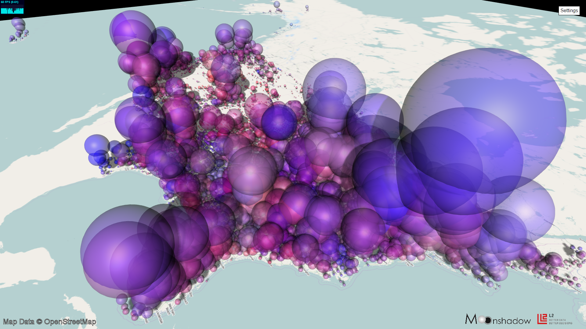
3. Washington DC and Baltimore Voters Colored by Party as Airborne Transparent Spheres
In the top two images all spheres were located on the ground. Because the spheres intersect you do not get a good feeling of how much larger the population in the cities is as cities as compared to the suburbs or rural areas. In the image above (#3) we elevated the spheres above the ground plane. The larger a sphere, the higher up in the air it was placed. As a result the large spheres obscure the smaller spheres and you get a much better idea of the population density in the cities as compared to the suburbs.
4. US Voters Colored by Party as Airborne Transparent Spheres from the Atlantic
For this image we zoomed out into space and looked back at the US. You can see the entire Atlantic Coast up front, Mexico at the left and Canada at the right top. The West Coast is visible at the far end. Voters in Alaska can be seen in the distance at the top and voters in Hawaii are shown just above the islands in the left top. The largest blue spheres show the population of New York. Miami voters are shown in the left bottom. Detroit and Chicago are shown in the middle towards the border with Canada. Along the West Coast we can recognize, from left to right, Los Angeles, the San Francisco Bay Area, Portland and Seattle.
The images were created using Moonshadow’s Ephemeris technology. The US registered voter data from L2 Political with 160 million voters is visualized in these images. The underlying map data is from OpenStreetMaps that is made available under the Open Data Commons Open Database License . With Ephemeris Moonshadow can visualize hundreds of millions of records instantly, and now in 3D.
Check out the animated video:

