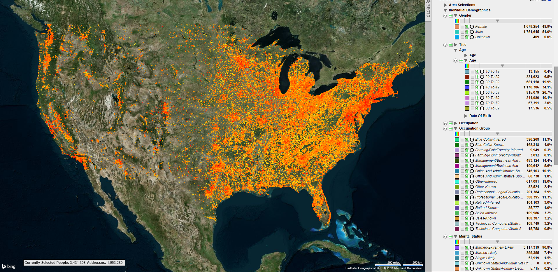
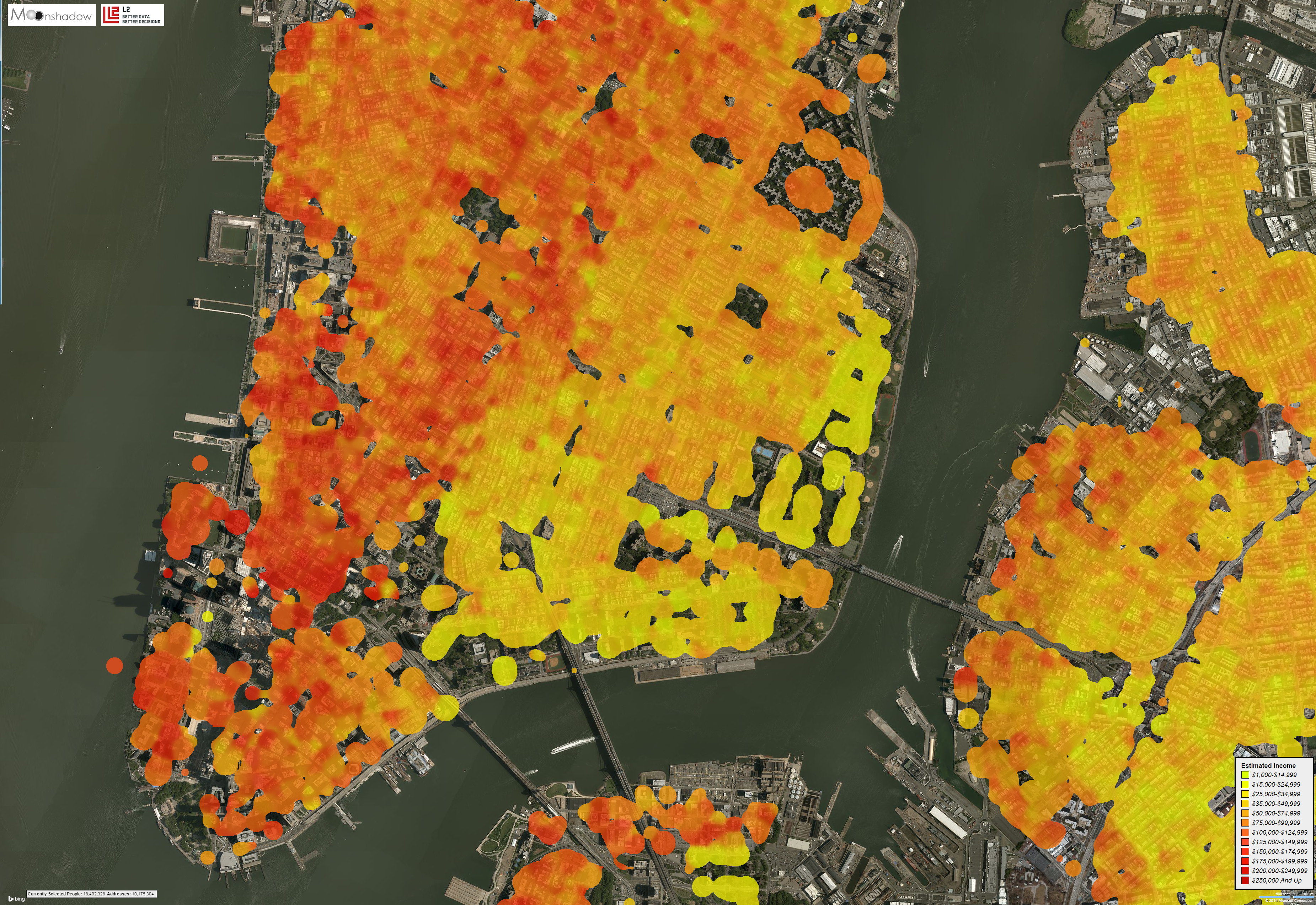
Income Levels in Manhattan
The images below show income levels in Manhattan overlaid on aerial photo’s. The income levels are shown from yellow for the lower incomes to red for the highest incomes. Click on the images to zoom in.
These data visualizations were created in the following way. We used the population data from L2 and mapped each address to a geographical location using Bing Maps. The L2 database has income information on over one million people in Manhattan. The base color of each geographical point was determined by the average income of all people on that location. Moonshadow’s Ephemeris software uses Gaussian curves […]